Tuesday, 31 January 2017

evaluation task 1

In what ways does your media product use, develop or challenge forms and conventions of real media products?

Throughout the campaign we used conventions and forms to create products that would be recognisable to the INDIE ROCK genre, and therefore we would be able to capture our target audiences attention and a wider audience of indie rock fans.
Here is a video I made on evaluation task 1
click here for the transcript of the video.
music video comparison made in the video with -

alt-j - something good, breezeblocks
foals - What Went Down
imagine dragons - gold
london grammar - wasting my young years 
the killers - shot at the night
the smiths - how soon is now, the charming man

album comparison made in the video with -

radiohead - in rainbow, the bends
glass animals - zaba
bastille - bad blood
kanye west - life of pablo
the smiths - hateful of hollow 
vampire weekend - contra 

website comparisons made in the video with -

alt j
milky chance
Lets begin by talking about the music video conventions. Here is a screen shot of the total conventions that we conformed too, developed or challenged 
[music video conventions]
Overall we found it a priority to maintain major conventions as with this music video it was meant for the indie rock genre, and we thought it inappropriate to make something too out there that it was unrelatable to anything but would have looked really cool, therefore conventions where important in grounding our project. In the pre-production stages I went into it with the intention of adding something to the medium that I hadn't seen before and that is what I attempted to do with the VFX, challenging conventions.
For the album cover, we attempted to push some ideas further from which we had seen in our research stages. As I speak about in the video we used inspiration from a HIP HOP album by KANYE WEST - called "LIFE OF PABLO".
[album conventions] 

While for the back cover we conformed too conventions as the back seem like a place of sanity, an area where the audience go to get information not to see some crazy images, therefore we kept most our innovations to the front. However, a second convention we did conform too that I forgot to put on the tally but mention in the video is that the name of the band is bigger on indie rock album covers than the name of the album, building the bands brand.

Finally the conventions for the website. We developed the landing page too have the album as the first thing the audiences see, this should probably be a convention we challenged rather than developed but anyways on the tally I said developed.
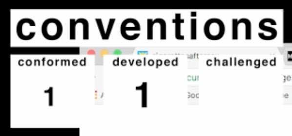
[website conventions]

But anyways as I mention in the video in research I noticed that non of the INDIE ROCK bands had there album on the front page, which i believed to be a very silly move, with the constantly stimulated minds of the millennial we would need to catch there attentions straight away. Therefore I put the album on the landing page as this could be the last and first thing they see so they know where they can listen/buy the album. While with the rest of website we conformed to conventions as it would make an easier navigational experience. 


In conclusion I believe we followed conventions when necessary but when we could we tried to either develop or challenge these conventions in the attempt to make a better final product, that not only attracted our target audience but maybe even a secondary audience, therefore increasing the chances of the survival of our band.

Friday, 20 January 2017

[feedback] developments and changes

From our feedback we where made aware of 2 major issues. "Cigarette" being spelt wrong on not just the album cover but on the website. So this is a blog post to highlight those changes.

First I began with the website.
Due to the gif being a separate layer to text, thankfully I only need to change the text and not the whole gif.


Next onto the album cover.
There where a few spots on the album cover I had to make the changes, for example the front cover and the spine.


Friday, 13 January 2017

[feedback] focus group for website and overall promotional package.

We conducted a new focus group of around 10 people to receive feedback for our final website and our overall promotional package.

Here are the questions we asked -

website -


Here is the main feedback for the website -

  • The name for the band was spelt wrong on our gif we had on the landing page.
  • the website was clearly not just aimed at the single music video

overall campaign -


Here is the main feedback for the overall campaign -

  • the digipak and the website work well together 
  • while the video is much more darker than the website and digipak
  • although there is a obvious theme through throughout 

Here is our feedback video


Saturday, 17 December 2016

final website

Here is the final design for our website -


You can check it out by clicking here or by putting this link into your URL [https://ashenpage.wixsite.com/cigarettesaftersex]

Overall I believe the final design for the website works. Its clean and simple, continuing on our design ideas of the colour red and the swan, which maintains now consistent throughout the media campaign.

So why did I use a gif on the homepage?


I animated the [origami] from the cover to add a somewhat USP to the website, make it something that is worth sharing, which would be appealing for our secondary audience. This as well pulls the audience in, there is something going on, and with the constant stimulation we receive with the internet i feel this fits its trend.

The rest of the website I believe follows the conventions very closely of the similar products, and I wanted to keep it like this, as this meant it would be easy to navigate for all users as this would be a common layout for most indie band websites.

Overall I believe it fits the campaign and launches the star image of the band to appear original and talented and therefore i believe it to be effective.

Friday, 16 December 2016

website creation

Here is a short video I made on the creation of the website, starting from the prototyping stage to the final creation in WIX.

Thursday, 15 December 2016

website draft mock up

Here we attempted to create the website in WIX. We wanted to experiment with the look and feel of the overall website and see if we could make something that fitted our overall campaign.


We followed the conventions of having the band on the front page, with the alert of the album being released. We as well integrated social links within the website which we also saw from the conventions.


We added the video, from our campaign.


Then tour dates, which we found was a major element used within indie rock band websites.


Then we had a small bit about the band.

Overall I think the design is nice but lacks character. Its boring and could be for anything, but I personally think it appears to dead to be for our band. Therefore in the next design I will start from the ground up, with a pen to paper prototype then straight into WIX to finish off the design, making something that is personal and fits with the overall design of our promotional package.


Wednesday, 14 December 2016

different conventions of homepages

To compare to my last post I am gonna right about different/unshared conventions to an Indie websites, by comparing Milky Chances website to Groove Armada's (who is a duo of electronic producers and DJs).


When landing onto there homepage the first thing you get top down is the name of the duo Groove Armada. Then you get a photo of one of them looking at the camera and the second member mirrored fancy either direction. Underneath this you have their social media links. Like the Milky Chance website it quickly establishes and advertises the artists, so people viewing the page instantly know what they are viewing. There menu is located on the right of the page and starts with the introduction to the website "Welcome" then you have their latest release, which is "Fabriclive 87" which is a compilation CD. Then you have there "Dates" of them performing. A "Free Download" and "Sounds". Then their instagram where audiences can connect to their lives. And finally their "Contact".


After there landing page you get there social media links and there email sign up instantaneously. Suggesting they are already an established artist that they don't have to sell anything before you wanting to sign up, suggesting that consumers will want to sign up even before they view the whole website.


Then we move onto their latest release, which has some text about the making of the product and what it means to them, then they have a quote, this will make consumers fill like they are being told a story and are more likely to buy into it as they have invested time reading it. Then they have links to purchase it and read more about it.


Under this it has there tour dates for electronic producers/DJ's this is the most important part of the website as DJ's will not be making money selling the few songs they have but playing live.


Then they have a free download which get you to input your email details which means even though you have got the free download you are signing up for more promotion from them.


Under the free download we are introduced to Sounds, this shows an embedded Soundcloud player with there recent mixes. This means audiences can get directly wired into one of there sets and here what they are up to either to continue the consumers consumption of their product or to introduce new audiences to their skill. Underneath this they have a link to Beatport where customer can buy their tracks.


Then at they have their Instagram again allowing consumers to by into their image. And finally all their contact details mostly for management.


shared conventions of homepages

Here is my investigation into shared conventions of a website homepage into similar genre. Here I investigated the elements that make up the Milky Chance website and why they use these elements.


The header of the Milky Chance website directly indicates there use of communication with audiences. The first thing down from the top of the page is there social media links, this will instantly encourage consumers to connect with there artists. Once the consumers is connected to the artist through social media there artists can begin selling more of their image which the consumers by into due to the incoherent star image. After these links you get the band name in big letters, this is the brand image. Under this you have the menus for the website, "Cocoon" is their newest release, then right on from that you have "Live" which shows the events that they are playing at, then "Videos" show the recent either behind the scenes videos or music videos they have created and the "Photos" section shows the images of them on tour.  The final element of the menu bar is the newsletter, this is similar to the social media links but it is more direct to the consumers inbox giving them constant reminders of the band.

(This is similarly shown on the Alt J homepage just in a different order.)


Anyways moving down the Milky Chance website you come across there most recent hit song music videos, this would be the music video for one of the songs that would have been received as most popular therefore they are trying to promote there best asset.


As you scroll down the page you find there latest release and for Milky Chance thats their single Cocoon. On this section of the website they have multiple links to where you can buy it and listen to it.

Next on from the release you get there live performances. This is the events they will be playing at and where consumers can go see them live. With digital downloads declining I am surprised that they haven't made more of an emphasis on live performances because thats how most artists make there money back now a days.


There video section is an interesting one, I expected that it would just be there  music videos but instead there primary video was the behind the scenes of the music video for their latest release. This is used to show the personality of the bands having some clips of them laughing and mucking about but as well being serious, this means that consumers can get to know and buy into their image. This is emphasised with there photos linking to instagram.


There newsletter sign ups consumers which I don't have much to say about it that I haven't said already. What I do find interesting is the footer of the page is the exact same as the header extra emphasising the fact that the audiences should be connected and following their artist.


Monday, 12 December 2016

why and how do bands use websites.

Bands and artists are now utilising the tool of the internet ever since the transformation to Web 2.0. They are able to connect, sell and make a statement with just one webpage.


A band/artist uses a website to not only advertise but also to gain a wider following and encourage their audiences to continually strive to make sense of the bands incoherent image. This can allow a following to begin as a bands website is the most up to date format of advertising for the band therefore it is a place and method of selling their goods for example music, concerts and merchandise, while keeping connected with their audience.


A website is an official way of establishing the band to the world and releasing the bands image world wide and accessible to everyone and anyone. This means that traditionally the only way a band image could be experienced is through concerts and albums. An example of the use of albums in a traditional method of brand image is shown in the Beatles band album developments starting from their debut album cover of the boys looking all friendly and nice and then looking more progressively serious till their final album of not even having a recent image of them. 

Here is a video analysis on that -

A website is a channel in which audiences can communicate with the band and other fans. Which is continued with the use of social media. Fans and audiences can receive live updates and what they are up to, in other words its the most updated advertising platform for the band. Its a key platform for enable global audiences.


The website is also a place in which professionals are able to book and contact artists for performances or for rights for films. 


Wednesday, 7 December 2016

[album artwork] our final design.

Here is the final digipak -


Here is the front cover -


Here is the back cover -


Here is the spine for the album -

Here is the inside cover -


Here is the CD cover -


Here is our final album design. In the end I went for a different’t approach and look then originally planned. I went for a lighter red, a more pinkish white colour, allow for a more female audience, that would generally appeal more to the gentle colours.

The front cover has Origami typed out a bunch and then Cigarettes after sex printed on top, creating a stylistic montage of text. While being a unique album design it strengthens the brand having the band name printed in large, putting the band into peoples minds on a subconscious level, making it more likely for them to come back and purchase a product due to familiarity. I followed the conventions of the Alt J album design and followed the creative path for the front cover instead of having a face.

The inside cover has the instruction to make an origami swan as planned, while I desaturated it to make it more neutral its multicolours I believed add to the overall album cover not becoming stagnant and therefore intriguing for audiences, and therefore wanting audiences to by more into their image.

The CD cover has the faces of the band members cut up making one face, because when it comes down to it all their unique realities make one unique sound. The faces have a pop art feel due to the cut out structure making it feel somewhat more organic. The faces reveal more about their identity and allow the audiences to buy more into their star image. For most of the similar products I found this section to be clean and simple and thats how wanted it, so I left it with just the image of the faces.

Finally the back cover. Through out the design process I found the back cover the most difficult. Most of the final designs were quite spontaneous in the small details, and this section I especially I found it difficult to make something I actually liked. I followed the conventions The Smiths back album cover, which was simple and clean, so I kept it like that and just added the swans because I took the swans off from the front of the design and I need it consisted.

Here is a video I made on the design process, with a special guest narration of myself -