
evaluation of our music video -
Our final video -
evaluation task -
evaluation of our digipak -

evaluation task -


Now, the production stage happen in two waves, the first wave the other members of my group attempted to put together an album design. And while their attempt was good it was at the standard we all believed should be for our final design. So therefore on or final attempt at creating the album cover we used technologies such as the Canon DSLR, a lens and lights.

The most important aspect in capturing the pictures for the album design was the Canon 5D Mark III. This was our photographer friends camera that she allowed us to use for the shoot. We used a Canon EF 24-70mm f/2.8L II USM Lens which allowed us to get wide shots of the band as a whole but also get up close and personal for some individual portrait photography. The outcome of being able to have this flexibility with the lens means that with the close ups we can get up close and personal with the individuals, therefore our target audiences are able to see their true expressions. The face is the first thing we usually judge when we see someone, to see whether they look like a person that is going to bring goodness into ones world or not, and this is what we where trying to capture with the photographs of the band. We wanted to show them as true artists and nothing more, therefore strengthening their star image. This means that target audiences would be more accessible in connecting with them as it would be less about sexuality and more about the true characteristic they are trying to portray. The closeups also opens the band up to a secondary audiences as it allows an audiences to make a judgement upon them instantly, and due to the band all being very pretty we would assume the judgements to be positive. What I feel from using this camera is that it has been successful in enabling us to capture the look we where seeking.
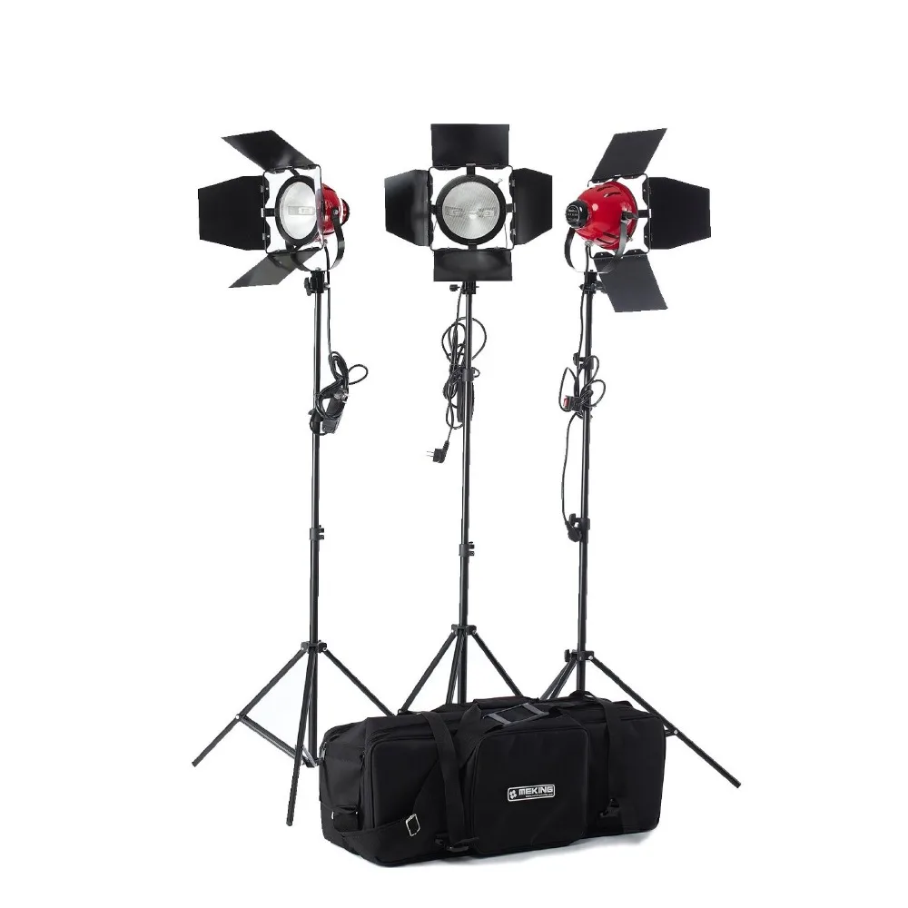
The lighting was important for creating a heavy contrast and making the band members stick out from the back ground. We used two red heads, which are industry standard lights. We didn’t use any gels, which alter the colour of the lights, as we knew we wanted to get the flattest image as possible so I could alter it how I wanted in post. The harsh contrasted lighting followed the convention within the Smiths album cover, who had a dark black background with the side of a person face. And this is how we had lit the scene. We had the boys stand in front of a back background to create heavy contrast with their skin tones. This lighting also strengthens their star image as it adds to the edge aspect of the brand, and follows once again the conventions but also is what our target audience with be attracted to, as it shows the boys to be extreme and different. Overall I felt the lighting enabled us to capture beautiful contrasted images that would give a strong impression of the band.
Now onto the final stage, the post production of the Digipak. This was the most fun area for me as I could get super experimental with it. We used technologies such as photoshop, my laptop and surveys.

For the creation of the album artwork I used photoshop. Adobe photoshop is a software that is widely used for image altering and art creation. I worked from our original prototyping. In the creation of the album artwork, I followed the conventions of typography with the band name being larger then the album cover name. I had everything very small but entered within each side of the album cover, while not only looking simple and clean it added to the star image of the band being originators and curators, due to aspects such as how we presented the name of the album multiple times, having origami tutorial engaging audiences, and using the origami swans on the back cover and finally having the cutout faces as one. Therefore creating intrigue not only for target audience but secondary audience which would allows those audiences to buy into the image due to the original aspects to it. However we followed many conventions, such as the type, but most importantly the names of the songs that would be on the album. Which used abstract words mixed with other words and then a name of person, or something that would appear to be a name for a memory, this allowed for our audiences to relate to our piece due to it not only being a conventions but also due the names tapping into core human conditions, such as relationships and past memories.

After all this design work we needed feedback for what we had done. We used Mircrosoft Word to collect feedback from our target audiences so we could make adjustments to our final work. Microsoft Word allow use to make tables for quantitate data, so therefore closed questions and then we could use text formatting to allowed us to show open ended questions. This means we could refine our designs but also how we could better translated what we wanted to our target audiences. We where able to see whether we had accomplished in following the conventions necessary to appear like our similar products.
evaluation of our website -
[Task 4] evaluation of the website from Ashen Page
here is a video on the website creation process -