Thursday, 1 December 2016

feedback questions for our digipack and music video.

So Monday we are going to showing our rough cut and digipack to a focus group and get there feedback.

Here are the questions we will give them -

DIGIPAK- CLOSED QUESTIONS

·      WHAT GENDER ARE YOU?
      WHAT IS YOUR AGE?
·      WHAT GENRE DO YOU THINK THIS DIGIPAK IS FOR?
·      IS IT EYE CATCHING?
·      DO THE COLOURS WORK?
·      WOULD YOU BUY THE DIGIPAK BASED ON THE ARTWORK?
·      DO THE TRACK TITLES AND ARTWORK WORK WELL TOGETHER?
·      DO THE TRACK TITLES WORK WITH THE GENRE THAT YOU THINK THE ALBUM BELONGS TO?
·      IS IT CLEAR THE ARTISTS ARE A BAND?
·      DO THE TRACK TITLES (THE BACK PAGE) WORK WITH THE GENRE?

DIGIPAK-OPEN QUESTIONS

·      WHAT ABOUT THE FRONT COVER DO YOU LIKE/ DON’T LIKE
·      WHY DO YOU THINK IT IS THAT CHOSEN GENRE?
·      WHY WOULDN’T YOU/WOULD YOU BUY THIS ALBUM?
·      WHAT WOULD YOU CHANGE ABOUT THE DIGIPAK?
·      WHAT DO YOU THINK OF THE USE OF THE FONT WE HAVE CHOSEN?
·      DOES IT BOTHER YOU THAT THE BAND AREN'T ON THE FRONT? WHY?

MUSIC VIDEO- CLOSED QUESTIONS

·      DID YOU LIKE THE MUSIC VIDEO?
·      DID YOU LIKE THE COLOUR SCHEME?
·      SHOULD THERE BE MORE SHOTS OF THE BAND?
·      WAS IT CLEAR THERES A LEAD IN THE BAND?
·      SHOULD THERE BE MORE SHOTS OF THE DANCER?
·      DID YOU LIKE THE COLOUR SCHEME?
·      SHOULD THE DANCER HAVE STARRED MORE?
·      DID WE INTRODUCE THE DIFFERENT ELEMENTS OF THE MUSIC VIDEO AT THE RIGHT TIME?


MUSIC VIDEO-OPEN QUESTIONS
·      DO YOU THINK THERE IS A LEAD ARTSIT IN THE BAND, IF SO WHY?
·      DO YOU THINK THE BANDS LOOK WORKS WITH THE GENRE, WHY?
·      DO YOU THINK THAT SOMETHING ELSE NEEDS TO BE ADDED, IF SO WHAT/ WHY IF NOT?
·      IS THE PACE FAST ENOUGH/ SLOW ENOUGH? WHICH ONE?
·      DID THE VIDEO HOLD YOUR ATTENTION IF SO WHY/ WHY NOT?
·      DID YOU UNDERSTAND THE SYMBOLISM BEHIND THE MUSIC VIDEO? WHAT WAS IT?

OVERALL QUESTIONS

·      DO YOU THINK THE GENRE IS THE SAME FOR THE DIGIPAK AND MUSIC VIDEO, WHY?
·      DO YOU THINK THE DIGIPAK AND MUSIC VIDEO WORK WELL TOGETHER AS AN OVERALL CAMPAIGN?
·      DO THE COLOUR SCHEMES LINK?
·      IS IT CLEAR THAT THE DIGIPAK IS NOT DESIGNED SPECIFICALLY FOR THE SINGLE?


what is quantitative and qualitative research?

Quantitative and Qualitative research are two research methods that are used to get data from participant about a certain subject. While the two types of research both get information from a participant they both do this very differently.


Quantitative research aims to measure and quantify information, using numerical and statistical analysis. Its main focusing is quantifying info, the most common method of measure is surveys. Quantitative research focuses on closed questions for example yes and no questions, therefore there is a clear distinction and no information is left up to researchers interoperation.

advantages -researchers are able to measure and analyse data.
clear relationship between variables.
objective, standardised, empirical data. 
disadvantages -answers are restricted to a yes or no.
context of the experiment is ignored.
large population has to be used in order to gain generalisable results.


Qualitative research on the other hand focuses more on open ended questions, for example “How does the colour red make you feel?”. Qualitative research looks at info that often describes emotional and subjective responses using words, rather than numbers. Qualitative research is usually taken place on small groups of participants as it examines the subject in more depth and can be time consuming.

advantages - leads to more in-depth insights into subjects
does not require surveying large no. of people
using online focus groups it can be significantly less costly. 
disadvantages -does not give a specific measure
does not allow for extrapolating results.

rough cut 1

Over the past few weeks we have been working hard on completing a rough cut for our piece, so we could get feedback from our target market focus group. I will go in more detail about my editing process in a later post.

The rough cut can be used to show our focus group then we can get there feedback and develop on our video. This by no means near to the final product, I really had to rush this to get in online for the deadline.

Anyways here is the rough cut video below -

Saturday, 26 November 2016

performance_roughcut1

So its a week after the shoot day, and I have been already working intensely on the music video. I will post a more in depth blog post on the editing process, but for now I wanted to discuss the rough cut for our performance.

The editing process we are taught for the editing the music videos is to begin with a performance cut. This means that if all else fails we can produce the performance cut for our final piece and that would be considered a music video as that would be the base element of our three elements.

Anyways so here is the performance cut, its only a rough cut so don't get over excited. But anyways I hope you enjoy. [WARNING: its quite slow to begin with.]

Thursday, 24 November 2016

behind the scenes.

Here is a behind the scenes video I made of our shoot day.

Wednesday, 23 November 2016

evaluation of the shoot day.


The day before the shoot day was probably more stressful than the actual shoot day. We had to make sure everything was prepared from costume to the set. We began the day going to the theatre department studios, where Elizabeth, who is in charge of costume for the theatre productions had left the hospital gowns. The first thing I noticed with the gowns were that they where one too big and two too plain, not exactly like the image I had sent Elizabeth. While it would be a shame that this small detail was not met as it better sells the overall look, but I knew I would just have to let it go and move on, as one of the biggest things I learn’t from my shoot last year is that you have to work with what you got, if you haven’t planned and prepared 150% you will never get the final vision you had, and this is one of the biggest lessons I believe I learn’t in this course accepting what you have and moving onto more important things. Everyday there is a music video shoot being done in the studios from the beginning of half term till the end of November. Therefore to make sure everything was set for my shoot the next day I created a check list of all the necessary set design elements and went through with the set designers and light
guy what we had previously discussed. When I went through the checklist with set designer she appeared in an uncertain way to have everything about but it was just a matter of collecting it all for tomorrow. When I spoke to the lighting guy, it become apparent that the rectangle of lights behind the band would just not be very intriguing. So I came up with having three pixel lights vertical pointing towards the camera behind the drummer, creating the dramatic silhouette we wanted but also giving us more control, so therefore for the drop we can turn on more pixelights as well I said I wanted flood lights either side, of the three vertical pixelights. A bit less confident as I thought I would be I got all my gear prepared for tomorrows shoot.

I woke up, picked my gear for the behind the scene and went to school. I wasn’t as nervous as I thought I was going to be, a wanted to maintain calm and collective throughout the day because for me personally I find it the most unprofessional when someone looses it. Once I found my group members we gathered all the band members as Georgia and I went round finding the last elements for our band performance. The bass they had laying about looked horrendous, it had these fire stripes on it, like something you would see on a kids toy truck not a modern indie rock band. Georgia and I
went on the search, we went to the music department where a student lent us his white bass that looked just beautiful. Once we got back to the studio we began setting everything up as the band members began to get the make up done and Hugo went over the lyrics. We began by bring in all the instruments drums, bass, piano and the microphone. I went t
hrough and made everything was symmetrical and well composed. Once we where done with that we did a quick rehearsal and then wetted the floor with a mop. Due to the room being black except the red pixelights, they would reflect off the floor making a cereal futuristic effect. Well this was super last minute it still relates back to our initial design elements for the band performance but now it was more intriguing. The red lighting made everything appear very sexy.


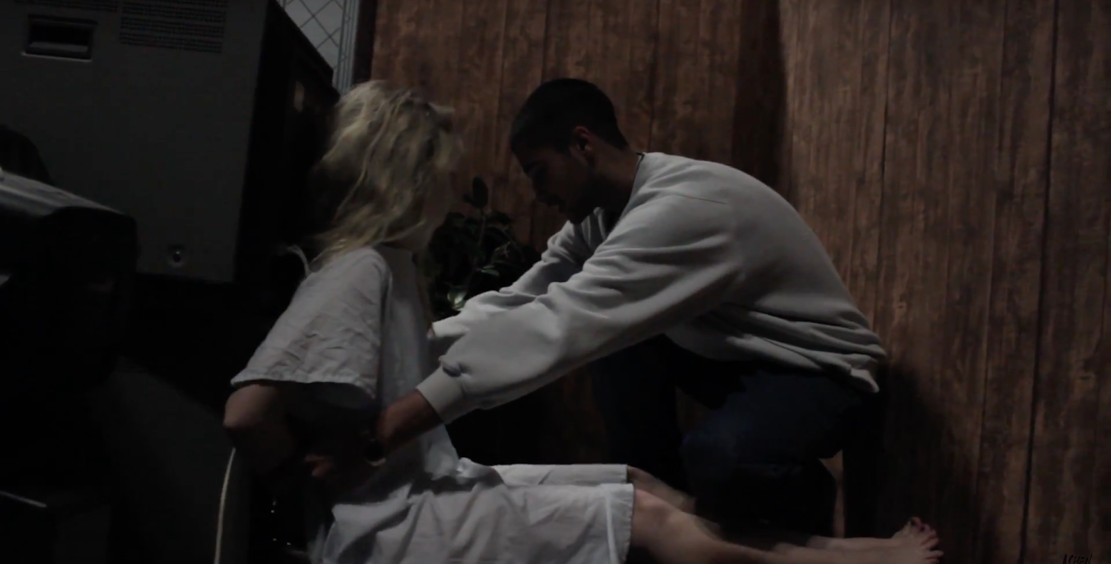
(the main girls make up developments throughout the shoot)

I was directing, but also helped Georgia with camera as she wasn’t very confident so I was happy to help. Directing is something I love but find difficult as you need to translate a concept you have in your mind into actionable language. Especially with actors you don’t want to make an actor feel insecure therefore something I have noticed is that you have to be very gentle when giving them feedback. However, this is the first time I properly enjoyed this role and I feel I communicated
wanted we wanted very accurately and the actors responded to feedback instantaneously. At most points I would have to take over the camera work for Georgia as she would struggle a bit, therefore I found multitasking quite difficult but it was super helpful to actually capture what I was directing as I could see how it was being portrayed on camera. We began by doing wides and then we would shoot mids and then closeups of each band member. After the first play through we realised that the song actually uses a guitar as well as synths, therefore we reshot the wide and gave Rory a guitar to have round his neck for the rest of the shoot. The band performance ran really smoothly however set us back on our schedule as there are so many different elements which we should of taken into account. Jess had been rehearsing the dance all morning with Cara, which Jess had been hiding from me as she didn’t wont me to be harsh on Cara. This was a big mistake and probably my biggest mistake of the day, not rehearsing the dance days in advance as this is a big element of our piece. The lighting didn’t looked as good as I thought it would the bars we had didn’t really appear well and weren't far enough apart.
After being very disappointed with the dance, we had lunch and then it was time for the narrative element. It took the set designer and with our help two hours to set up the narrative piece, which the wallpaper was nothing like I wanted, making the set design into some weird cross cultured display. I had printed off the images of the Japanese women just days before but now it was somewhat irrelevant as the culture in which the set appeared did not really make sense, it appeared more like our original set design of being a country club. Time was disappearing and it was a Friday so are actors would soon be leaving. We had three teaches and one actress. The set design took an hour longer then we prepared for and the teachers had to all get substitutes to cover their lessons. We tried to shoot it as fast as possible, which will show in the final result as we hadn’t got enough shots of the old men.


Overall I believe the most successful part of the shoot day was the beginning as everything was on schedule and everything looked how we wanted, as time got tighter throughout the day the attention to detail began to slip. I really wish the dance was would have looked better, I think we may have to do a reshoot when we do our pickup as we forgot to have the dancer in the container. I was happy with the narrative, however we didn’t get enough it, however do to the lack of time I made sure that we shot all of the narrative in slow motion as this would mean it would give us double the footage, and do to the lack of time we would have more to work with. I really enjoyed managing the actors they were very responsive and all except one teacher tried their hardest. I am really excited to work with the narrative when it comes to the editing as I have the VFX shot to work on also I have it all in slow mo so I can get quite experimental. That might be how we save the dance by going super whacky artistic like an MTV promo kind of thing, like inverting the colours and have only blues or something like that. When it came to it the production group were really professional to work with only my media group seemed a bit uninterested at points which put off some actors and made them feel awkward. Other than that we worked well together and I am excited to see how the footage came out.

Sunday, 20 November 2016

[album artwork] the groups digipak.

While I have been away editing the girls finished of the digipak. Here it is...

FRONT -

BACK - 


INSIDE -


This is a really nice start on the designs and considering the photographer bailed on the group the day before the deadline this is a pretty good result.


Saturday, 19 November 2016

[album artwork] track list.

The music video we have made is only for one song from the album, so therefore there would be other songs. This list of songs are known as the track list. So for our album we have come up with a bunch of songs that we think fit the genre conventions. Here are two back covers of albums from our genre of indie rock.


from the research we came up with our own names for the songs and produced our own tracklist of songs for the album, which we think would also fit the star image of the band and as well connecting with our target audience.


Friday, 18 November 2016

[album artwork] claudia's research into fonts.

I found some interesting font ideas that would work well with the photos on the album covers.


BAND:

I like this font as its clear, as well as being eye catching. I think that it works with the genre as it is subtly. However, I think that the font would need to be bolder as this title needs to stand out more than the bands name.


This font is cool. However, I think that it would work better if the genre of the band was Rock rather than Indie Rock. I like the way this title stands out, however. I also think that it would appeal more to our target audience than the other font as its clearer.


I think this font looks like a font that would more be used for a book title. This is due to it having a slanted and artistic like look to it. I think that we would want more of a block title that would represent the genre more.


I found that this title like the font before it was also a bit too artistic.


This font is my favourite out of all of them. This is due to the ease of it. The font is simple yet easy to read and works well for the genre.

ALBUM:

I thought this font was cool. I thought that it worked with the Indie part of the genre. I think that this font is unique. However, it reminds me of the Netflix writing. Therefore according to our target audience they would be likely to watch Netflix. Therefore, it takes away the originality effect.


I think this font would work really well with the bottom font of the Cigarettes After Sex, as the fonts aren't the same but work well together due to the look of them.


This font is original and cool. However, it does't work well with any of the other fonts.

Thursday, 17 November 2016

[album artwork] final prototype

Group - discussion/design


After coming together with the each others designs we all agreed we love the Origami Swan and would want to keep this featured through out the artwork. We like the colour red as it is very eye capturing as is closely associated with female lips and genitals (nipples and vagina lips), subconsciously making it appealing to men.

When we where discussing names for the band Georgia came up with the name cigarettes after sex which we all believe has a really nice ring to it that would fit well with an indie rock band. After deciding the name we agreed on the album to be called Origami, which fits the overall bands star image of being creative thoughtful, and gentle like origami, as well identifying with our target audience.

Origami - is the Japanese art of folding paper into decorative shapes and figures.

Therefore our album cover would be a red origami swan. With the font lightly embossed with the title origami underneath the Swan. The band name would be in the left corner in a larger font, this is what I find constantly in my research into similar products and the text would be black to make it stand out even more.

The back design would be the band surrounded round and watching the TV screen with the Origami figure on the TV like in our music video. We all agreed we like the element of my first design front cover but with this new design of the band staring at the TV, also giving space for the text of song names making it less messy and more clean. I think its important to have the band members featured somewhere on the album design, and I we all agree from the research into similar products the band members would not be featured on the front cover, making it more about the music rather than the image. However this little square gives the consumer a little glimpse into their image without it being in your face.

For the CD cover Claudia had designed folds, following the paper design which we all thought was really cool, so we all agreed we would go with that. Finally for the inside cover, as we where discussing designs I thought what could be quite cool would be to have instructions on how to make an origami swan, which I think would be quite nice. Due to CD sales being lower than ever compared to streaming, only a few people would purchase the CD and only a few people would get to see all of the artwork, including the origami instructions. Therefore this touch makes it more personal, following the star image of creativity, but also making it seem as if the band is your friend as they want to teach you something even before you have had a change to listen to their music. As well this could start an origami trend that would get the name of the band out their, so therefore this simple piece of design could create free social media marketing.

We had a majority vote on having the origami swan front on, I think symmetrically this is more pleasing, and in a way a bit confrontational as it is directly looking at the customer, which could create a mesmerising effect. When looking at this album cover I believe that the ideology of our band is somewhat apparent as the Origami Swan, illustrates something that is while small and fragile but appears powerful, like a lot of their songs, also caring on the idea of them being creatives rather than just a pop band selling their image, this is done by the fact that they are apparent on the front cover as well creating intrigue for the customer.

To create the final design we are going to have to organise a photoshoot with the band, and re-using the props from the set e.g. the tv and the origami swan. We are going to need to get another red origami swan and photograph that for the front cover. We are going to have to research instructions on how to make an origami swan for our own instructions. The final design should look very clean, therefore we will finesse the images in photoshop and add the final bits of text in photoshop.