

Here is a screenshot.

So What I would want for the front of the album is the black boarders with the artefacts, then in the middle the TV which is featured in our music video, on the TV screen I would want all the bands faces to make up one face cut up into four squares. On the back of the album I would want there to be the back of the tv and wires coming down, it would feature all the songs names and all that on the top of the back cover. The CD I would want wires coming out from the centre and the names of tracks round the sides.
While in my research to similar products I found no images of the band on the front cover, I think it is a necessity to have the band somewhere on the album and I have kept this in mind through ought my designs. It is important that the band is an integral part of the design, as it allows the audiences to begin to recognise the brand, and therefore begin to build the bands brand.
The boarders would be black to show the emptiness, while the TV would be in colour like in the music video. The colours for this album design would be very mono but the colours for the TV would be over saturated, this would be used as a trigger to grab the audiences attention. I think our target audience would like this album as the artefacts add a grungy element to the design, which they would identify with, also the TV would pull them in as it does in reality.
I really like an album like this as it gives the band the star image of being creative and artist rather than just trying to sell themselves, however I don’t think it is a good idea to to have the main elements of the album design to be focused on the main elements within the music video, for examples the TVs. This is because its a cover for the whole album which consists of many songs rather than a single, therefore there would be likely to be at least two other videos that would be most likely different from the one we have done for our project.

As I mentioned above in the research I didn’t find any band covers with the band on them, however this bands where already quite established when the albums came out so therefore the wouldn’t need to build a brand however, I assume, our band is still becoming a established and this would be their debut album, therefore it would be a necessity for the band to establish their band image, to allow audiences to connect/identify with them.
This album cover is a very organic approach as it just shows them as who they are and nothing else. It shows the whole band as one face as they all are coming together to make one sound. It’s a very simplistic album cover, which I think an indie band would be interested in using for their first album as it clearly and simply shows who they are, as one. I feel our target audience would be very attracted to this as it isn’t overly flashy and it is what is, just the band and the main focus of it being about the music, which I think our target audience would appreciate.

Ok now we are onto my third design I went for a bit of a more creative approach. The image of would be of a face on black background to emphasis the loneliness, the face on the head would be cut out. And what would appear to be within its mind would be the TV from the music video. The album would be called treasure lake as that’s something empty and obscure an indie band would use. I got inspiration from a tutorial by spoon graphics.
Here is the inspiration.
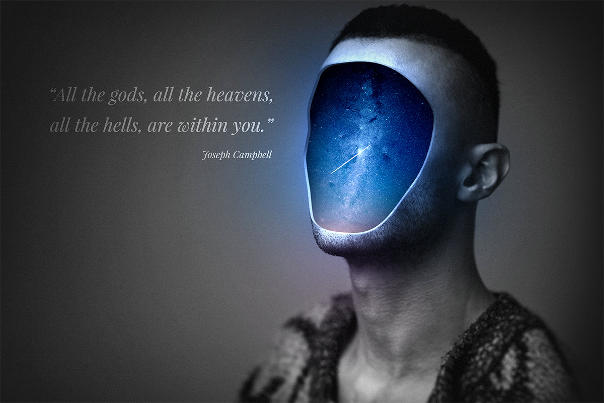
Well I say inspiration I am pretty much completely ripping off the idea. The back of the cover would have the back of the head with the titles of the track. On the inside cover the there would be an image of a red origami swan, because as we discussed in our group we would like this to by a symbol of the band, like a logo. The CD would have lines/dots on it and as it span it would show the songs on the album (as I write this I am thinking about how stupid and impossible that idea is, always good to be ambitious though).
The overall design is somewhat mysterious. Why is there this empty head? Why is there a red swan? It keeps the audience questioning, what the star is. This will make the consumer by in to more of their products to fulfil that need to understand that star. I believe this design fits the target audience as their image is rather hipster and I believe this design would be something a hipster would be interested in pinning up on the wall above their toilet. The artwork is quite obscure but also very metaphorical, as it suggest our thoughts are just regurgitation of what we have watched.

My fourth album variation comes from my original album design done for the photoshop crash course at the beginning of the year (featured below). The idea of weird creepy hands grabbing a crown. So I have integrated that idea with the TV. The album would be called projected reality, as again mentioned above our reality is just a projection of what we have seen and experienced, especially from films therefore projected, like a film projector. In the design it appears as if the hand is placing the TV down, as if god is giving you an insight. On the flip side it has the image of the band performance from the music video. On the CD I placed the origami piece which should feature in our whole designs, keeping it consisted will keep audiences questioning. And then the back cover would be the back of the TV with the titles.

(my album design from photoshop crash course)
This quite an obscure album cover, which shows the TV to minute and therefore what ever is holding it must have a lot of power, making audiences think. If you get a passer by to at least think thats the first step to get them to buy the product as that will be playing through their mind subconsciously, and the more they think about the more familiar they will become with it, once you are familiar with something the more likely you are to buy into it. Therefore I believe this album cover to be very capturing but also intriguing out target audience as it is quite unusual, but also simplistic.
Overall I like this design however I believe the band should be featured in less unnatural setting, for example being part of the art rather then being a completely different piece of art. However other than that I believe it follows the other designs very closely and therefore from all these design variations I believe we could come together as a group and come up with a very solid album design.