
So I have spoked in more detail in my conventions post about the conventions of indie rock, but in this blog post I am going to be speaking about similar products to Glass Animals Toes for album artwork.
The artwork of any album should tell a very important message about what is contained in that album while capturing the audiences instantly, as the album cover is in theory the first impression. The bands album artwork I am going to talk about is Alt J, Radiohead, The Smiths and The Vampire Weekend. All completely different types of indie rock. However, with all very similar elements in album design.

 The first thing I thought of when I hear Glass Animals track Toes was Alt J. The two bands have a very similar style of music, with the quite soothing intros then the upbeat but mysterious choruses, that make the two songs commercially successful. This digipack is from Alt J’s album An Awesome Wave. The front cover in an unconventional manner, does not show the title of the album. This fits to the convention of indie rock, as indie rock tries to move away from the direction of convention. Due to the album cover not stating the name of the album, the album must remain rememberable on other levels, and I think this is accomplished well with the unique abstract streaks. The album shows a bunch of streaks which appears to be some sort of liquid coming together forming larger amounts of liquid. The album cover is dressed with texture and popping colour, that juxtaposes the dark backdrop. While it is a simple cover it is effective as it makes the audience think about it, making them try to piece together what it all means.
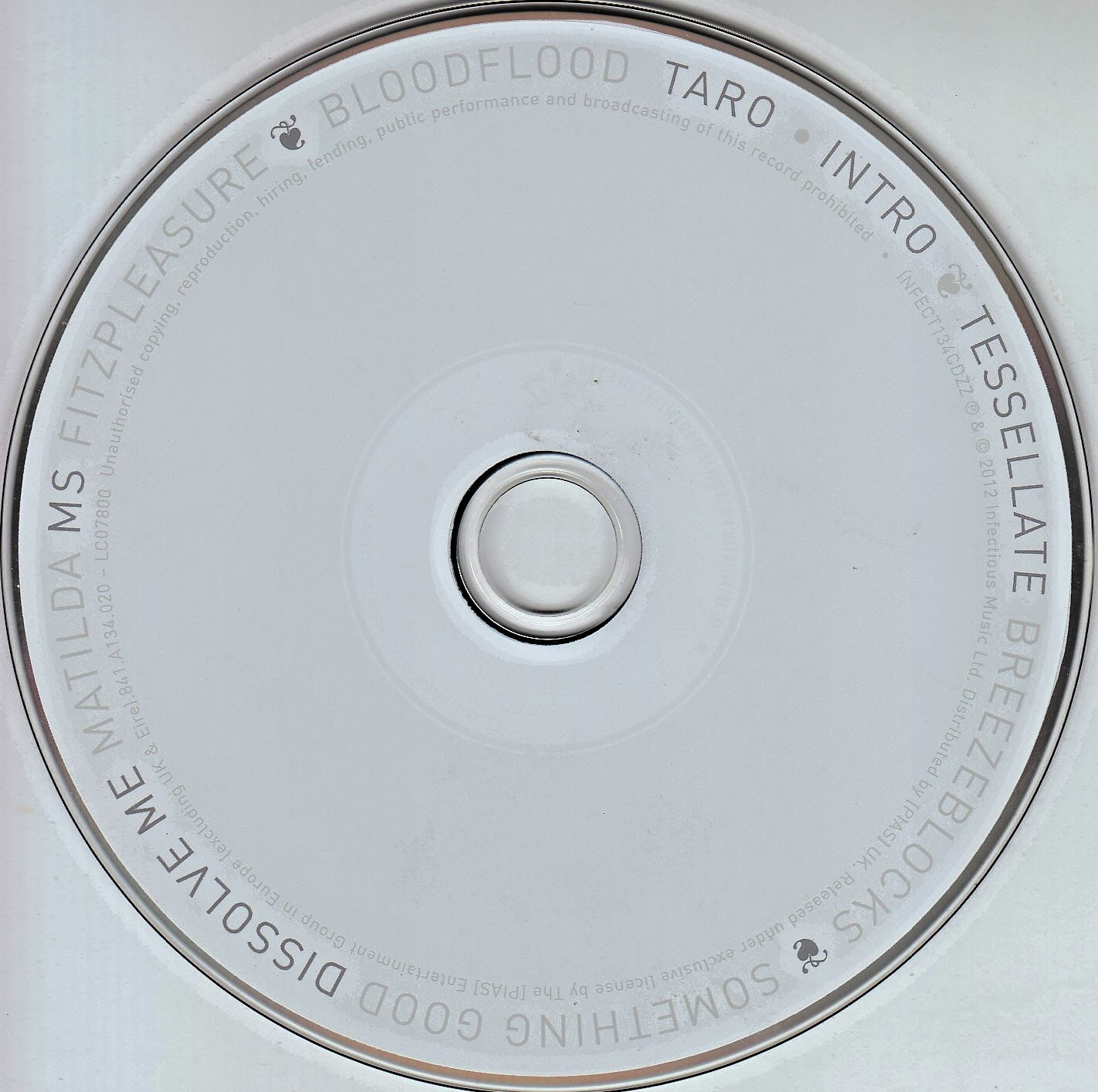 The CD is very simple, which I like. It is clean and clear, all it has is the names of the songs around the edges, one feature I feel it is lacking is the number at which the song is played, which makes the text on the
 CD somewhat unhelpful. But again this adheres to the convention of indie rock trying to act misunderstood. The artwork juxtaposes that of the main cover. The abstract art of the main cover leaves the viewer intrigued and mesmerised but there is an element of overwhelmingness due to the intensity of blacks but also the balance of the colours which when used are overly vibrant.
 The back cover like the CD shows track list in order. The theme is very similar to the CD juxtaposing the front, like everything its the release of the tension from the front cover. Like the CD there is some interesting decoration on every other line of text, making the plain clear white back cover appear to be a bit more funky. This follows the star theory idea of originality, due to the front being so abstract the back can contrast that and ground the artwork.
 Radiohead the bends is the first album artwork I am going to discuss featuring a human like figure on the front cover. The image appears to be a CGI interpretation of a human sighing in release. The white CGI human is contrasted with the dark black background making its white pinkish pigment very apparent. On top of this unlike the Alt J album artwork, Radiohead is printed across the front of the album cover for the bends in white with a red rectangle wrapped round the text, with the name of the album underneath but considerably smaller in red text and lowercase. Red is a colour closely associated with danger therefore internationally it is very quickly recognised and therefore gages ones attention. The CGI has some weird appearing metal abnormalities on the front of its body which brings it back to the idea of the album cover adhering to the indie rock conventions of being controversial and to make one think. This follows the star theory of appearing to be original.
 The CD is plain and simple, featuring a small image at the top and numbers at the bottom, the CD however does not have the track list on. The appearance of the CD juxtaposes both the front and back cover. The back cover is much more intense than the front, it explores the colour red even further, featuring dark and light reds with numbers place on the light and the dark as the background. The text is in white with a numbered track list. On the left it has the image that was on the CD and the scannable barcode. This follows the idea of what I mention above, tension and release, the front of the cover is the release the back is the tension, following the convention of the intensity and mystery of indie rock.
 The smiths album has a face on the front cover, only half of ones face. The white face is heavily contrasted with a black background like the radiohead album making the face stand out. Like the type of music the font of the text is blue, with the name of the band again like radiohead in large text and the name of the album in smaller text but on this album, the text with the name of the album is wrapped with a blue rectangle. The man in the image is wearing a white vest making him appear young and vulnerable, also due to the lighting hiding a lot of his face. The mystery of this character follows the convention of mystery within indie rock, as well a sense of dismissal towards the audience, as if the band is doing what they want and you can like or not but they don’t really care, this dismissal is what will make loads of vulnerable listeners buy into their image.
 The CD follows the colour theme of the font on the front of the album cover, with white text giving the track list on top. This makes the text easily identifiable and easier to read. On the CD it has the name of the band in big type again and the name of the album in smaller type. In even smaller type its got the track list details which is numbered. The back of the cover is simple and clean, featuring the majority of white and at the bottom the blue background then white text on tope similar to the CD giving of clean cool aesthetics. The white space makes the album feel clear and to the point, which works well to make the barcode look as if a decoration due to it fitting so well with its settings.
 The Vampire Weekend album Contra similarly to Radiohead’s and The Smiths album has a picture of a person on the front. This time its a girl and she appears somewhat surprised, the image has a quite natural and unplanned aesthetic to it. This allows the audience to by into the idea that they are not so different to them, making the audience not only identify but buy into there indie rock convention of not being perfect. This follows the star image of somewhat rebellion due to this. The image has white text on the front, the name of the band and the album in the same font.
 The CD is a bit more interesting to the others, it has a completely different design too the front, some sort of web that sucks the viewer in. The CD has the track list numbered around the edges, name of the band in small and the name of the album bigger, so they fit in the same box. This contrast with the front picture because out of know where they have graphic design, where the front cover shows naturalism, the CD image shows more of a control and thought put into the design. This design is somewhat similar to the back design which features the track list with interesting weird sudoku appearing boxes to separate up the
 text and adding that graphic design element.

Overall, I really like the artwork on all these albums, I believe it really shows of the idea of independency and breaking away from the mainstream due to the unsettling abstract image that don’t give you the whole story. It is interesting that non of these covers feature any of the band members, but instead either abstract art or an abstract person, in a natural but mysterious pose. All this albums create intrigue and all have an impact in there individual ways due to the contrast and the heavy text.