In the seminar we began the track with a clapper board, so we can sync all the film clips up accurately as the clapper would play 5 or so seconds before the song would begin. All the actors in the piece were my fellow students. Here is what we created in this short session.

Monday, 6 June 2016
Lip Sync Task
Today we head down to the studies to have a practical lesson on shooting music videos and lip syncing. To be able to accurately sync video with music in non real time the actor or artist must follow the soundtrack previously recorded and attempt to replicate the lyrics of the song in time with the music, this is known as lip syncing. So what this means is that when we come to the editing stage the editors can quickly and accurately sync the pre-recorded music to the lyrics.
In the seminar we began the track with a clapper board, so we can sync all the film clips up accurately as the clapper would play 5 or so seconds before the song would begin. All the actors in the piece were my fellow students. Here is what we created in this short session.
I was pared up with another student in the editing suite who myself and her did not gel well together and took us a while to finish the project, on average the other videos created by my fellow students lasted around 40 seconds while ours was just over 20 seconds which highlights the time consuming process of syncing up the audio to video. Its a slow and boring process, I believe we get bored when our brains aren't stimulate therefore we get some sort of discomfort to make us seek stimulation, this is the same with problem solving. If your not problem solving you will get bored quickly and that is what happened with this project, it was just matching up numbers of each film frame, which did not make this a fun task. However I learn't a bit about the general process. Although when it comes to it I will most likely use software like Pluraleyes to sync up the footage to video.
In the seminar we began the track with a clapper board, so we can sync all the film clips up accurately as the clapper would play 5 or so seconds before the song would begin. All the actors in the piece were my fellow students. Here is what we created in this short session.
photoshop tutorial
Today we got a photoshop tutorial and a task to complete in photoshop.
here are my notes from the seminar:
- you are what you consume
- what you absorb from your environment will effect your actions
- always start on paper
- mind maps
- get down all your ideas in a organised format, meaning you can go back at any point and look for inspiration
- helps to develop and expand initial ideas
- design storyboard
- shows gradual developments
- gives customers an idea of your progression and they may prefer something previous in the development rather then the final piece
- mind maps
- inspiration
- trying different ways of ding things
- peripheral learning
- no tutorials
After the seminar we where given the task to create a piece of album artwork. So fueled with motivation from the seminar I came up with an idea for a rap album. After making a few sketches and looking at different pieces of street art I came up with the idea of having a hand in black and white holding a saturated crown on white background, with the text of the album on black.
here is the speed art of the creation of my idea in photoshop.

a music campaign.
A music campaign is what revolves around the music in the fight to get it heard. For example a conventional music campaign would have album artwork, a website, a music video and the artists/label would utilize social media in capturing a following.
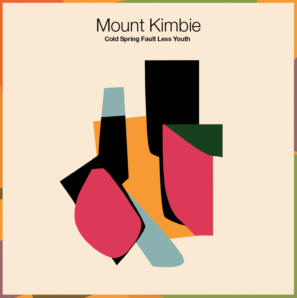
Here is an example of all this with the electronic duo known as Mount Kimbie. Mount Kimbie is london duo that produces abstract, organic, field recording, electronic music, if that was genre that would be Mount Kimbie's genre. There production sounds very inspired to the likes Four Tet who also is a british producer who uses electronic elements but also field recording to create organic masterpieces. The target market for this type of music would be approximately 17-30 year old or people who are generally quite interested in unique obscure music, aka the underground scene. Due to this unique style of production Mount Kimbie have entered and niche and somewhat creates a usp for there music, in the world of electronic music everything is so precise and calculated it is nice to hear something that isn't so perfect that makes it somewhat perfect, that's there usp. If you see from the music video, album cover and website all these three elements link together quite nicely. Keeping there imagery very consistent. This is important for smaller artists as it creates an association, also known as a brand, and this is what they would be recognized by and create a following with. This is style is kept constant by the unique cut up colours and the off white background sealing all the pieces together. However while the pieces are kept very constant and somewhat similar the products are also unique in there own way. For example the music video begins with the album cover and the name of the artists but then goes on a psychedelic journey that follows the pace of the song. While the album follows the shapes of the album it is as well very modern and slick. This pieces are made to be different so the consumer feels as if they are going on a journey and therefore investing into the musicians with there time therefore likely to become attached to these figures.
To sum this short essay up I believe this campaign to be successful as the consistency but unique differences are somewhat comforting as they lack change however keep in you intrigued at every step of the way. Not only that after going through the experience of this campaign the artists are not easily forgotten therefore I believe this to be a successful campaign.
Sunday, 5 June 2016
Comparing Nas and Amy Winehouse's albums


Overall the two album show completely two different things, even though both the artists being organic. The album emphasises the idea of feminity however as well displays her in a natural light, as well showing her to be from the streets, which suggests the album topic as the same as Nas’s album. While Nas’s album colours and overall feel shows a rougher feel therefore a more masculine feel. Nas’s album cover appears to show that the topic of his childhood would be prevelent, while Amy’s appears that she will be talking about more present pressing issues in life at that moment.
Subscribe to:
Posts (Atom)